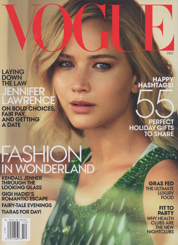
I've changed my magazine that I was going with, but I think that I did succeed of recreationg the mood of the magazine. It might have a bit different feel to it, but overall I think it looks great.
3) Put your cover alongside a couple of genuine covers of your chosen magazine. How professional is your work alongside genuine examples?
I think I need some more practice, but it's not bad. It was hard for me to find the right color and font for my cover lines.
4) What is the strongest aspect of your work?
I really like my work with the flowers on the logo. It's a detail that makes the cover look a lot more professional. I focused on the logo the most, trying to create a new edition of the cover, but with a little touch of my style.
5) What is the weakest aspect of your Photoshop magazine cover?
It was hard to put the cover lines in a good an visible position. They're also a little too big and the color is a bit off. Also I feel like the photo is to stretched.
6) What would you do differently if you completed this assignment again?
I would choose a different location and do a little ore preperetion with the costume and props before the photoshoot. I would also reseach information about magazine cover an the way that the cover lines are placed.


Comments
Post a Comment